Wouldn’t it be cool to get faster results with less effort? That’s what “click reduction” does.
It’s the software development principle we call LNOC or Least Number of Clicks. It’s one hallmark of well-designed software and makes running an ISP easier. Just ask ISP owner John Garber. He has been using the beta software everyday for a week now, and click reduction stands out for him as an excellent improvement. “Although it seems to be a trivial detail, it makes my tasks really smooth,” he says.
Here, we tell the story of what happened to the missing Edit button. But first, the plot:
LNOC is a primary goal of our development at visp.net. Here are some examples and some new features you’ll notice in Ultimate Front Office™ 5.0 beta for your common tasks:
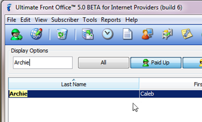
- Conduct a search anywhere in the software. That’s right: no matter where in the interface your mouse cursor is, as long as it’s not within a text input field, you can type in a subscriber detail and it will automatically become your search criteria in the Find box. There’s no need to click in the find field and no need to execute a search with a click. Just start typing! Your search results appear in real-time and are filtered to eliminate irrelevant records. Note: we did this before Google — those copycats. =)
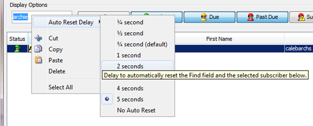
- In addition, your text automatically selects and resets after a delay that you can set with a simple right-click. What’s new in this version is that the “Auto-Reset Delay” has been moved to the top of the right-click menu and we’ve added a tool tip as a reminder to optimize the reset to your typing speed.
Searches are so frequent, this feature alone can literally save thousands of clicks per year. While this feature is in the previous version, it’s SOOO COOL, we had to tell the story again. Now back to the missing Edit button.
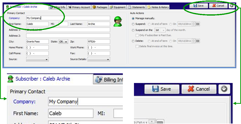
- Instantly edit subscriber details in the lower tabs without having to click the Edit button anymore — just enter your changes directly into the fields and a single save takes care of all edits on all tabs. So the edit button is gone; where did it go?
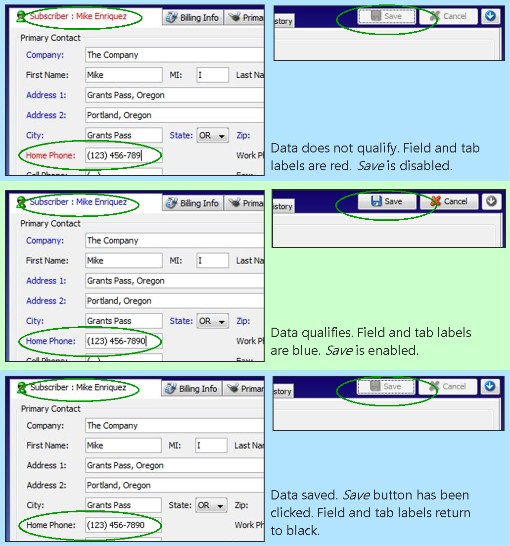
- Real-time input validation throughout the software means no error dialog clicks in the event the software detects an error. This nifty little feature solved the interface conundrum of how to save data modified in multiple tabs, making the software more intuitive.
- Even more, you can use arrow keys on your keyboard to scroll through subscriber records. That means if you’ve just used the uber-cool search feature, you don’t have to slug your hand from the keyboard to the mouse to find the record you want. That’s less motion and faster results.
All this input validation and click reduction paved the way to gracefully give the Edit button the boot along with all his clicky friends. Bye bye, Edit button… bye bye, clicks… Hello, ease… Hello, happy ISPs.
Experience the ease in beta at https://visp.net/betarun.


